 Skip to content
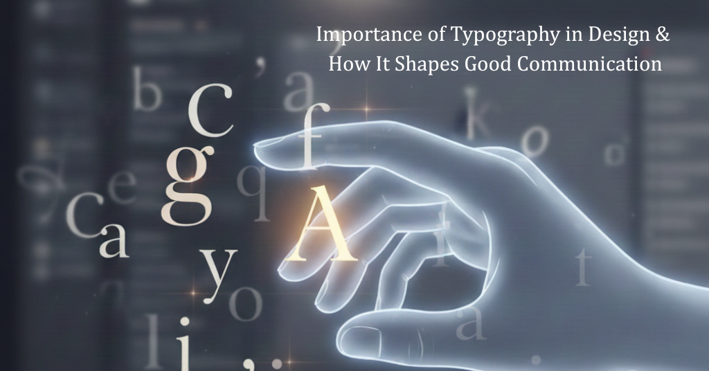
Welcome to the Locas Institute, Ludhiana blog! As a leading educational center in design and digital arts, we often highlight the fundamental elements that separate good design from great design. One of the most overlooked, yet profoundly important, elements is typography. Far from just choosing a ‘pretty font,’ typography is the art and technique of arranging type to make written language legible, readable, and visually appealing. To truly succeed in any visual field, mastering this skill is crucial. This deep dive focuses on the undeniable Importance of Typography in Design, influencing everything from user experience (UX) to brand credibility. In today’s digital-first world, understanding how type works is essential for anyone involved in graphic design, web development, or content creation. Typography isn’t just about choosing a pretty font; in fact, it’s been said that typography is 90% of good design, and mastering it can transform how your message is perceived.
What Exactly is Typography?
Contents
At its core, typography (often referred to as ‘type design’ or ‘font choice’) is about giving a voice and a visual structure to your words.
The term covers everything from the selection of typefaces (like Arial, Times New Roman, or Helvetica) to the technical adjustments of the text itself. It’s an art form with a scientific backing, influencing how a reader’s eye moves across a page or screen.
Key Elements of Typography
To truly grasp the importance of typography, you must understand its basic components:
- Typeface vs. Font:
- Typeface (e.g., Helvetica) is the design family.
- Font (e.g., Helvetica Bold 12pt) is the specific style, weight, and size within that family.
- Kerning: The space between individual letters.
- Tracking: The uniform spacing across a range of characters or an entire word.
- Leading (or Line Height): The vertical space between lines of text. Too tight, and the text is hard to follow; too loose, and it looks disconnected.
- Hierarchy: The arrangement that guides the reader’s eye, often using different sizes, weights, and styles (e.g., $\text{H}1, \text{H}2, \text{Body Copy}$).
Why is Typography Important in Design?
The importance of typography in design cannot be overstated. It’s the silent partner of your content, drastically affecting user experience, branding, and conversion rates. Here are the top four reasons why this skill is vital for success:
1. It Ensures Maximum Readability and Legibility
The primary function of text is communication. Good typography makes sure that communication is effortless.
- Legibility is how easily individual characters can be distinguished (e.g., is a capital ‘I’ different from a lowercase ‘l’? Are the numbers clear?).
- Readability is how easy it is to read and comprehend large blocks of text (e.g., is the line length too long? Is the contrast sufficient?).
Using appropriate font selection and optimal line spacing prevents eye strain, keeps users on your website longer, and encourages them to consume your valuable content. Poor readability, on the other hand, is a leading cause of high bounce rates. Good typography guides the reader through content effortlessly, reinforcing structure and clarity. Learn more about the role of typography in visual hierarchy and readability to see how it impacts design effectiveness.
2. It Establishes a Strong Visual Hierarchy
A strong design uses typography to tell the reader what’s most important. By varying size, weight (boldness), and color, you create a visual path.
- Headlines ($\text{H}1$) draw immediate attention.
- Subheadings ($\text{H}2, \text{H}3$) break up long text and allow for scanning.
- Body Text delivers the detail.
- Call-to-Action (CTA) buttons use contrasting typography to stand out.
This structure allows readers to scan text quickly—a crucial habit in online reading—and find the information they need, greatly improving the overall user experience (UX).
3. It Defines Brand Personality and Tone
Typography is a powerful tool for visual branding. The typefaces you choose instantly convey a personality before a single word is read.
- A financial institution might use a traditional, trustworthy Serif font to signal stability.
- A modern tech startup might opt for a clean, futuristic Sans-Serif font to signal innovation.
- A children’s brand might use a handwritten or rounded font to signal playfulness.
Consistent use of type styles reinforces brand recognition across all mediums, from your website and social media to printed brochures and logo design.
4. It Enhances Accessibility and Credibility
Professional and thoughtful type arrangement lends an air of authority and trustworthiness to your content. Conversely, using too many fonts, clashing styles, or low-contrast colors makes a site look amateur, immediately damaging your brand credibility.
Furthermore, good typographic practices, such as choosing accessible font sizes and ensuring high color contrast, are vital for making your design usable by people with visual impairments, adhering to modern web standards, and boosting your SEO ranking.
How to Shape Good Design with Effective Typography
Now that you understand the importance of typography in design, here are actionable steps to implement great type in your projects:
1. Limit Your Font Choices
The golden rule for type pairing is to use a maximum of two or three typefaces—one for headlines, one for body text, and perhaps a third for special callouts. Overusing fonts makes a design look chaotic and amateurish. When pairing, aim for contrast: a classic Serif for a title and a modern Sans-Serif for the body text often creates a dynamic, readable combination.
2. Prioritize Contrast and White Space
Ensure there is sufficient contrast between the text color and the background color. Dark text on a light background (or vice versa) is the gold standard for legibility. Equally important is white space (or negative space)—the empty areas around your text and design elements. White space gives your text ‘room to breathe,’ making it less intimidating and easier to read.
3. Master Line Length and Leading
For comfortable reading, your line length should typically contain between 45 to 75 characters per line. If lines are too long, the reader’s eye can get lost when moving from the end of one line to the start of the next. Adjusting the line height (leading) to be approximately 120-145% of the font size also dramatically improves reading flow.
Take the Next Step in Your Design Career with Locas Institute!
The art of type arrangement is the foundation of powerful visual communication. If you’re ready to move beyond just picking a font and truly master the Importance of Typography in Design, a structured learning environment is the key.
At Locas Institute in Ludhiana, we offer in-depth courses in Graphic Designing and Web Development where typography is a core module. You’ll learn hands-on from industry experts, focusing on practical projects that build your portfolio and career.
Don’t just use type—master it!
Visit our campus in Ludhiana or check out our Web Design Courses and Digital Marketing programs online.
Enroll now and transform your passion into a profession!
ALSO READ: How to Design a Business Card in Canva : Guide for Beginners
FAQ about Importance of Typography in Design
Q: Is typography only for graphic designers?
A: Not at all. Anyone who creates content—whether a content writer, web developer, marketer, or blogger—uses typography. Good type skills are essential for all digital communication to ensure messages are effective and engaging.
Q: What is the difference between a serif and a sans-serif font?
A: A Serif font has small decorative strokes (or “feet”) at the end of the main strokes (e.g., Times New Roman). They are often seen as traditional, formal, or good for print. A Sans-Serif font (literally “without serif”) does not have these strokes (e.g., Arial, Helvetica). They are typically seen as modern, clean, and are favored for digital design and screens due to their clarity.
Q: How does typography affect SEO?
A: Indirectly, but powerfully. Google prioritizes user experience (UX). Good typography leads to better readability, a more professional look, and lower bounce rates, which are all positive signals that contribute to higher search engine rankings. Using proper heading tags ($\text{H}1, \text{H}2$) is also a fundamental SEO practice.
Q: What is a ‘type system’?
A: A type system is a structured approach to applying typography across a project. It defines the rules for every text element (e.g., all H1s are 48pt Bold Montserrat, all body text is 16pt Regular Roboto). It ensures consistency in design and is vital for large websites and complex applications.


