
Negative space is one of the most important principles in modern visual communication. Understanding how to use negative space in graphic design can instantly improve the quality of your layouts, logos, and digital designs.
Many beginners focus only on colors, fonts, and images. However, professional designers know that what you don’t add is just as important as what you do. At Locas Institute, Ludhiana, students learn how to apply negative space effectively to create clean, powerful, and professional designs.
In this blog, we will explain negative space in graphic design, its importance, practical examples, and expert tips to use it correctly.
What Is Negative Space in Graphic Design?
Contents
- 1 What Is Negative Space in Graphic Design?
- 2 Why Is Negative Space Important in Graphic Design?
- 3 How to Use Negative Space in Graphic Design Effectively
- 4 Examples of Negative Space in Graphic Design
- 5 Why Learn Graphic Design at Locas Institute, Ludhiana?
- 6 Start Your Graphic Design Career Today
- 7 Frequently Asked Questions (FAQs)
- 8 Conclusion
Negative space refers to the empty space around and between design elements such as text, images, icons, and shapes. It is also commonly known as white space, although it does not always have to be white.
Positive Space vs Negative Space
- Positive space includes the main elements like text and images
- Negative space surrounds those elements and improves clarity
When balanced properly, negative space enhances readability, structure, and visual appeal.
According to experts at the Interaction Design Foundation, negative space plays a crucial role in visual hierarchy, usability, and user experience in both graphic and UI design.
Why Is Negative Space Important in Graphic Design?
Using negative space correctly makes your designs more effective and professional.
1. Improves Readability
Proper spacing between text lines, paragraphs, and sections makes content easier to read.
2. Creates Visual Balance
Negative space prevents clutter and allows each design element to stand out clearly.
3. Highlights Key Elements
Extra space around headings, logos, or call-to-action buttons naturally draws attention.
4. Enhances Brand Image
Clean designs with proper spacing feel premium and trustworthy.
Leading design platforms like Adobe also emphasize that smart use of negative space helps designers communicate ideas more clearly and professionally.
How to Use Negative Space in Graphic Design Effectively
Let’s explore practical ways to apply negative space in your designs.
1. Use Negative Space to Create Visual Hierarchy
Negative space helps guide the viewer’s eye across the design.
Tip:
Add more space around headings, key messages, and important visuals to create a strong visual hierarchy.
This technique is widely used in modern graphic design layouts and website design.
2. Improve Typography with White Space
Typography becomes more readable and visually appealing when combined with proper spacing.
Best practices include:
- Increasing line spacing (leading)
- Using margins and padding properly
- Avoiding overcrowded text blocks
Well-spaced typography improves user experience and engagement, especially on websites and mobile devices.
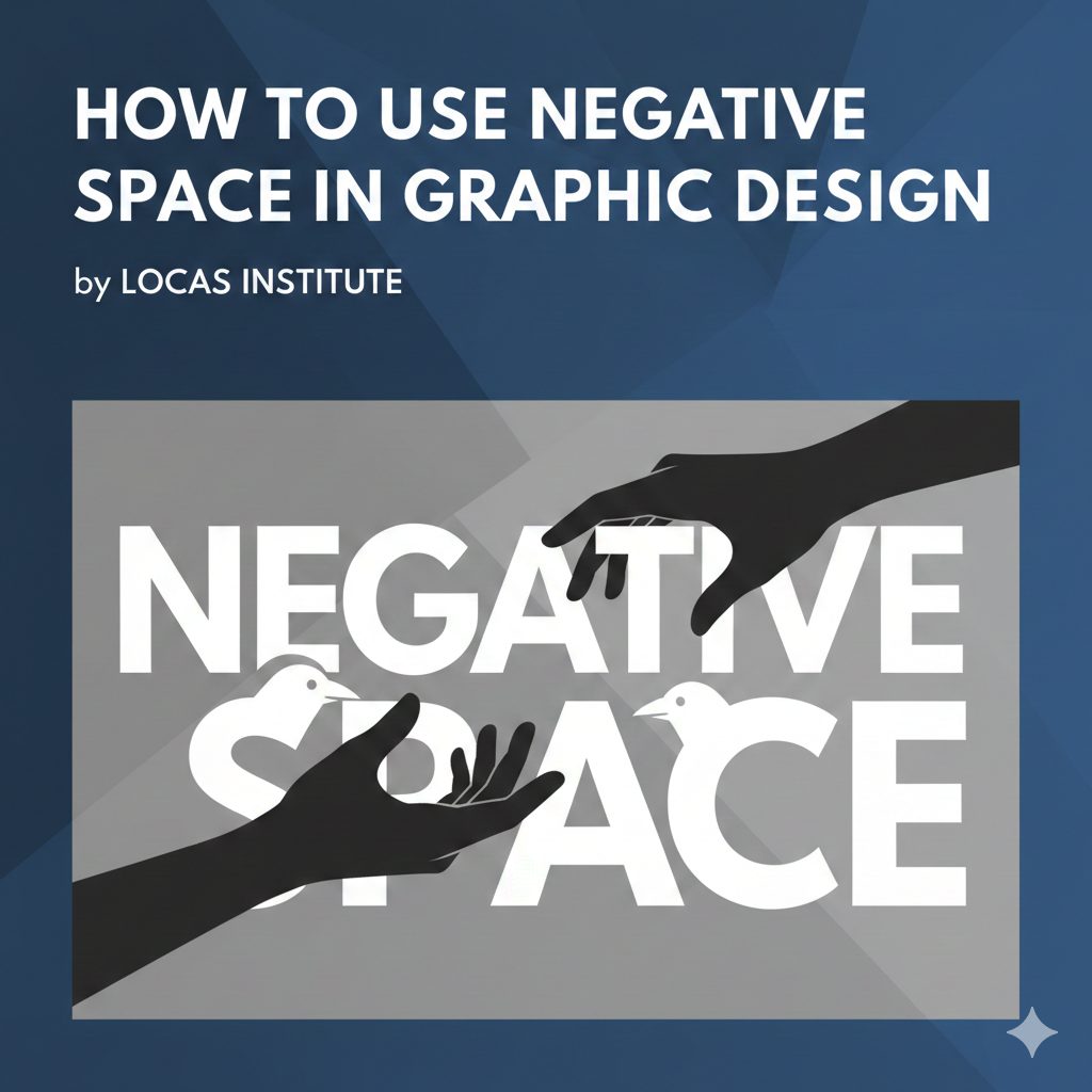
3. Create Creative Designs with Hidden Meanings
Negative space is often used creatively in logo design to hide symbols or messages within the background.
Many famous logo examples featured on Smashing Magazine demonstrate how designers use negative space to make logos more memorable and meaningful.
This technique is especially popular in branding and advertising design.
4. Apply Negative Space in Web and UI Design
In web and UI design, negative space improves navigation and usability.
Benefits include:
- Cleaner layouts
- Better focus on content
- Improved conversion rates
Beginners can also explore layout and spacing exercises from Canva Design School to understand how white space improves clarity and design flow.
5. Avoid Common Negative Space Mistakes
Although negative space is powerful, incorrect usage can harm your design.
Common mistakes to avoid:
- Too much empty space that makes designs look incomplete
- Too little space causing clutter
- Inconsistent spacing across pages
The key is maintaining balance and consistency.
Examples of Negative Space in Graphic Design
Negative space is widely used in:
- Logo design
- Posters and banners
- Website layouts
- Social media creatives
- Print advertisements
At Locas Institute, Ludhiana, students practice these concepts through hands-on projects and real-world design assignments.
Why Learn Graphic Design at Locas Institute, Ludhiana?
If you want to master essential concepts like negative space in graphic design, professional training can help you learn faster and more effectively.
What Locas Institute Offers
- Practical graphic design courses
- Industry-experienced trainers
- Live projects and portfolio development
- Beginner to advanced-level training
- Career guidance and placement support
Our courses are designed to make students industry-ready.
Start Your Graphic Design Career Today
Want to become a professional graphic designer?
Learn essential design principles like negative space, typography, layout design, branding, and UI/UX from experts.
Join Locas Institute, Ludhiana today and turn your creativity into a successful career.
Contact us now or visit our institute to enroll in our Graphic Design Course.
Frequently Asked Questions (FAQs)
What is negative space in graphic design?
Negative space is the empty area around design elements that improves clarity, balance, and visual appeal.
Why is negative space important in graphic design?
It enhances readability, highlights key elements, and creates professional-looking designs.
Is negative space the same as white space?
Yes, white space is another term for negative space and can be any color.
How can beginners use negative space effectively?
Beginners should focus on simplicity, proper spacing, and avoiding clutter.
Where can I learn graphic design in Ludhiana?
You can learn professional graphic design at Locas Institute, Ludhiana, which offers practical and job-oriented courses.
Conclusion
Understanding how to use negative space in graphic design is essential for creating impactful and professional visuals. When used correctly, negative space improves creativity, communication, and user experience.
If you are serious about building a career in graphic design, Locas Institute, Ludhiana is the right place to start.
Design smarter. Design cleaner. Design better.


